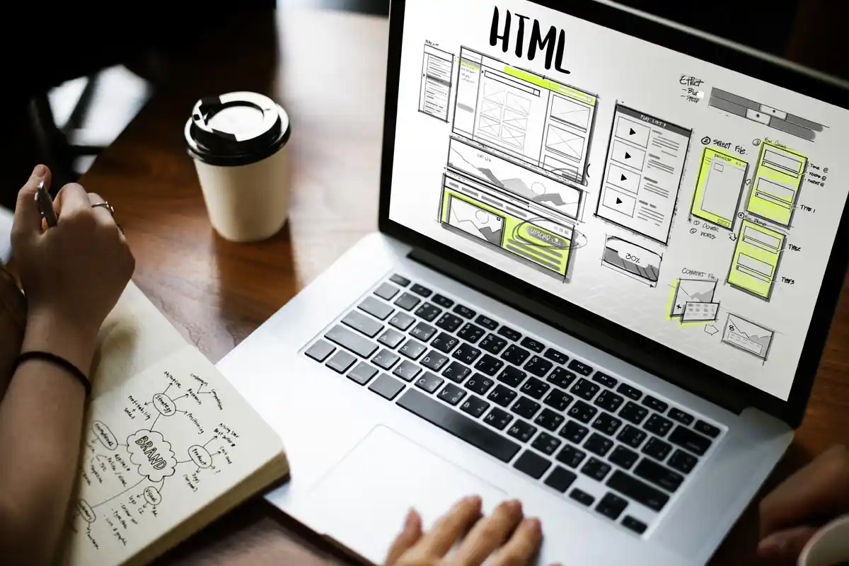
Once a major design trend went off the grid for a few years there. But, since landing pages are becoming more popular each day, the Web design Fad (and obviously a very user-friendly one at that!) is making a comeback. For better user engagement, designers are adamant on deploying single page designs with interactive story-telling techniques and other interesting features, in order to increase visitor time on their websites, especially on mobile. And mobile users - the highest number of website visitors – are accustomed to scrolling.
MONOCHROMATIC DESIGNS
Colour is what defines a brand. It cultivates the mood and unifies a brand.
Having millions of colours in your branding palette is great, but limiting the branding to one colour helps enhance a design and makes it more memorable to a website viewer. Moreover, monochrome can help solidify your branding.
ASYMMETRICAL LAYOUT
When they say grid, designers are referring to an imaginary set of horizontal and vertical lines they use as guidance for placement of elements, divisions and spacing. Ideally, everything needs to align with this pixel grid. But rules are meant to be broken hence, enter the asymmetrical layouts.
Such layouts drive the eyes to a certain direction where there is comparatively more going on. Asymmetrical layouts provide a lot more room to creativity than the plain old grid rules.
OVERLAPPING DESIGN ELEMENTS
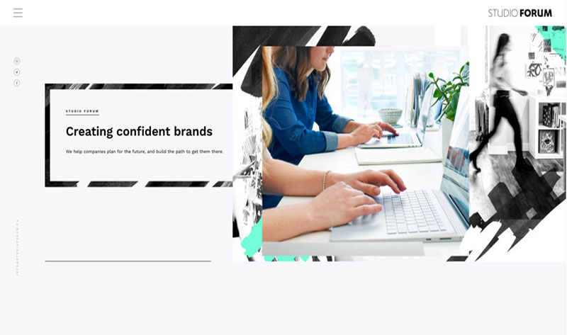
Somewhere in the same category as asymmetrical layouts and broken grids, overlapping elements could bring new aesthetic value to the website design and make it look daring and spontaneous. Experimenting with overlapping objects also brings an element of surprise for users as they scroll and see something unexpected.
But, such a design style could get challenging if not executed properly. Especially, considering different resolutions for desktop, tablet and mobile. If not done with proper calculation, overlapping could go terribly wrong, resulting in confusion on the viewers' end.
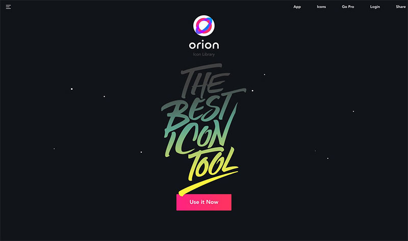
SERIFS/ VINTAGE FONTS
Serifs are the new Sans.
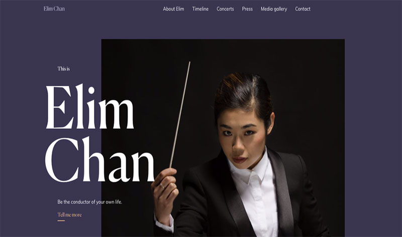
Our eyes are trained to see serif fonts on print, and sans serif on screen. But trends aren't quite trending until we are made to see something strikingly different right? Breaking the conventional design rules yet again, some web design masterminds introduced the idea of Serif fonts on website design. While Sans is still the ultimate choice for website copy, because of its versatility and readability, we see more and more brands inclining towards Serif fonts for headers, taglines and callouts.
It makes sense; Serif fonts were initially meant to be used for decorative purposes and for emphasis. Serifs are usually associated with maturity or older times, but there are a lot of fonts which are versatile and blend-able with the rest of the design. Teamed up with delicate sans serifs, a little sharp Serif here and there gives the website design a lot of character and make up a great font combination for a brand.
MINIMALISM
Lately, more and more brands are requesting a minimalist layout. Not only a minimal website stands out from the competition, avoiding all the clutter makes the website very straight-forward; the users are introduced to the product/service right way.
If the conventional elements don't occupy the space on a web page, then the designers incorporate animation, fade-in effects, chatbots or some other interactive elements to liven up the website.
USAGE (OR NO USAGE) OF WHITE SPACE
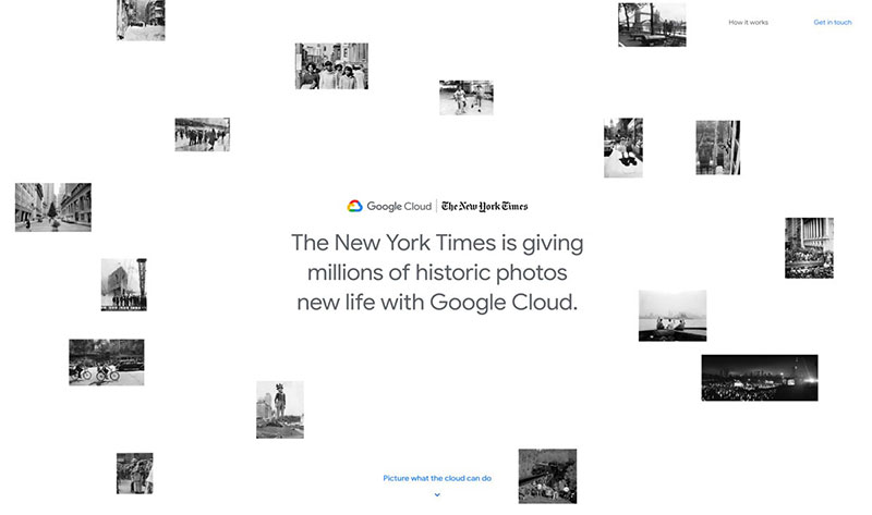
Just like the "grid", "white space" or "negative space" are a thing in the design world. Conventionally, there is a safe balance between black and white space that doesn't compromise the aesthetics and readability.
The unexpected factor, of white space, is the 'extra white space'. Falling along the same line as minimalism, the layout redirects the focus to the USP. Conversely, adding a bit too much makes the white space an important part of the design layout.
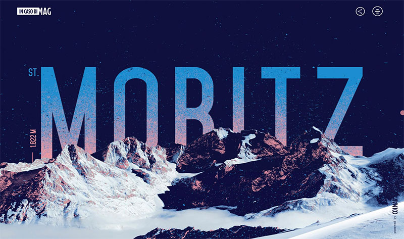
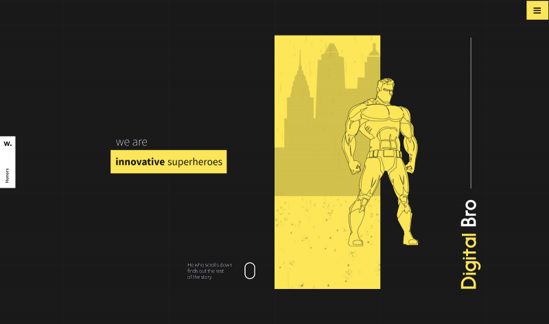
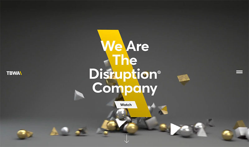
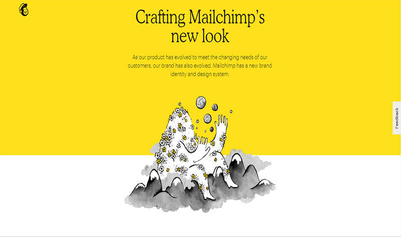
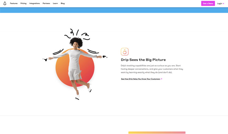
ABSTRACT DESIGN & SHAPES
Abstract art, with its expressive power, is strong enough to build an emotional connection with the human mind.
Our mind works in the craziest of ways and secretly wants to see the craziest of things that are almost, but not quite real. Keeping that in mind, designers go an extra mile and incorporate abstract elements in the websites to keep visitors enthused with crazy, surreal objects moving about.
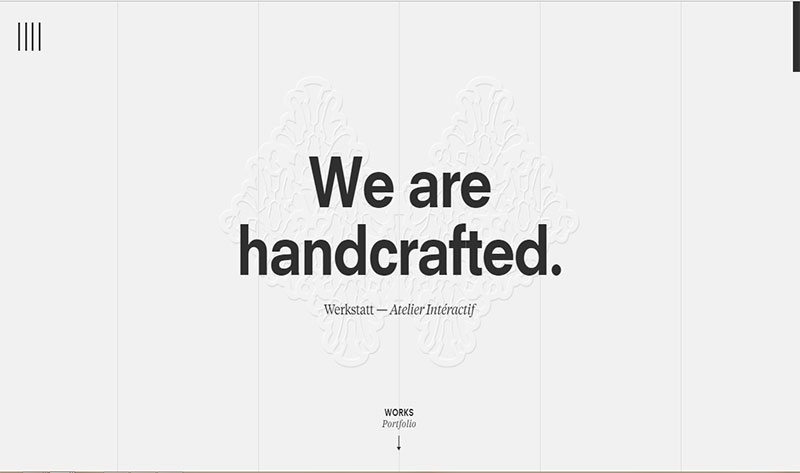
The colors and characters in the abstract art connect with emotions; users feel personally connected and picture themselves in those designs. Anything that is handmade or personalized, feels a little closer to you.
The prime goal of using abstract elements in website design is to make it timeless, and optimal user engagement. This will be a trend we will see more of in 2019 and later.
GRADIENTS
Gone are the days when gradients meant a transition of two opposite colors, just because the concept was new.
Thanks to artisan designers, the once-famous gradient trend is enjoying its strongest revival. With their eye for aesthetic, website designers make the most of gradients by putting two or more colours that complement each other the most. They add a fun flare of color to an otherwise bland layout.
Gradients have become a whole self-standing design technique, not only in website designing but also in typography, packaging design, logos, E-signatures, branding stationery and app designs as well.
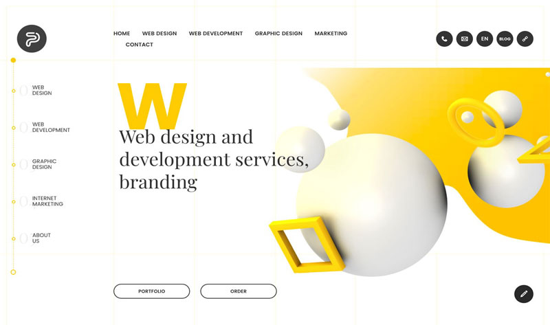
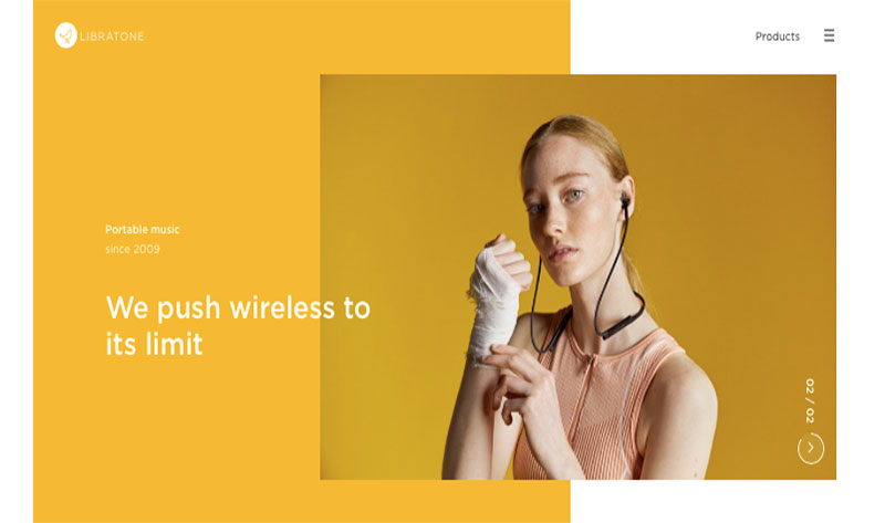
SPLIT SCREEN DESIGN MAKES A COMEBACK
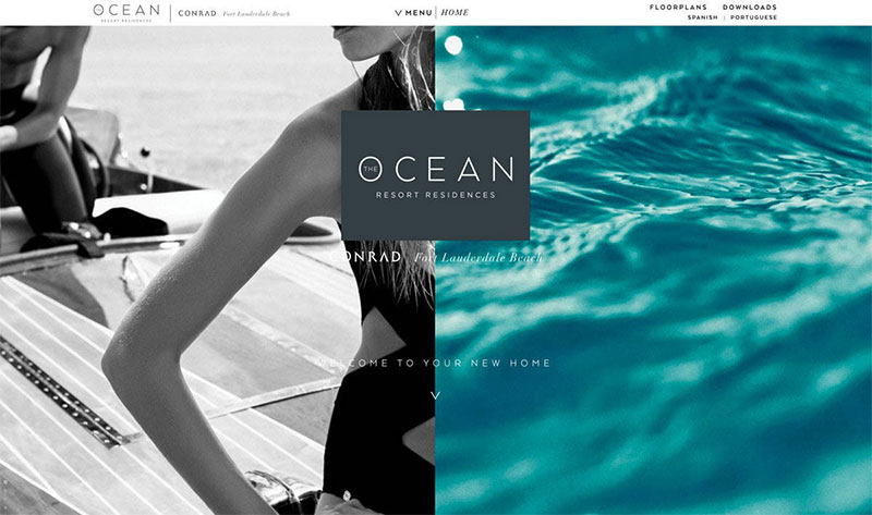
Split screen layout occurs when the desktop screen is split into two equal panels. A picture with its respective content alongside is usually how it goes.
The split-screen layout continues to be recurring.
Some brands care about seamless experience above all else. If a website displays a diversified range of products/services (apparel stores, design agencies etc.), conveying all the selling propositions becomes the biggest challenge.
That's when a split screen layout seems like the smartest choice. Flawless user-experience, responsive design and website copy that's on point; this modern-day classic layout just cannot go wrong.
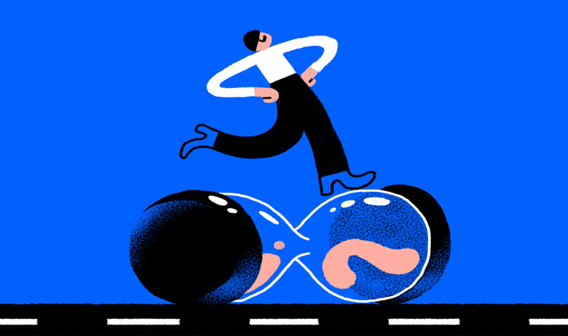
MICRO- INTERACTION
WHAT ARE MICRO-INTERACTIONS?
Every time there is a small activity from a user, like scrolling or hovering, 'add to cart' or 'add to wishlist', a specific response is generated in return of that specific action, is a micro-interaction.
IF the font explodes into a coffee stain, if the cursor turns into a heart (triggering you to add that item to wishlist), if a border is formed around an image upon hovering, if a slideshow begins or fades in/ fade out happens, is when you know there was a micro-interaction.
It increases the attention span and keeps the users engaged and enthused into finding more about the website.
This technique is famous among online stores and games websites. We anticipate more and more website designs that are inclusive of these fun user-engagement elements in 2019 and later.